I am wondering about why some people care so much about how things look. I know I do. I notice when things in my world don’t look too good generally they don’t work so well either. The thoughtlessness of design often crosses both appearance and utility. I see the outside color of cars that don’t look right with their interiors, I crave to color the 4 different levels of the SFO airport parking garage different colors so people like me can remember which floor their car is parked on. I keep having to buy different dog collars because the color and pattern doesn’t aesthetically fit the personality or color of my dog Maisey. I literally have taken paint and adjusted a color on a new pair of running shoes just so I could wear them.
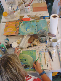
I am not proud of this affliction—I can’t remember a time I didn’t have it but I can imagine how easy it would be to not carry this concern. Artists and creative people in general tend to have this sensitivity to their environment. A work around to these feelings is achieved by taking a small piece of the world and re creating it exactly as you desire. This is usually results in some form of Art. So no matter what is going on around you, no matter how everything else looks or feels at least you have contributed something, that according to you, it is exactly as it should be.
My daughter, Hannah, is applying to college and let me read some of her ideas and rough drafts of things she was thinking of writing about. In one of them she too shares her experience of feeling this unease with parts of her surroundings…like mine hers began at an early age.
“After leaving the beauty of my childhood home, filled with sophisticated colors of oak, natural browns and burnt oranges, one can imagine my immediate revulsion at the neon storefront signs on beige mealy walls flying past me on my drive to school. I vehemently abhorred nearly every graphic decision at my middle school, our mascot the sharp, menacing blue-sky lion, the staid lettering of the Saint Mark’s School sign I had to pass each morning. What bothered me most was when the graphic design and typography did not match the feeling of the particular institution or person. To me, it was nothing more than misrepresentation.”
Apart from feeling guilty for obviously passing this irksome trait on to her, it just kind of hit me how unusual it is for a 3rd grader to be concerning themselves with how things look and feel. Is this normal?
Clearly she is already one of those people who fall into the hyper visually sensitive camp. Is it that this small minority of overly sensitive people should be put in charge to re-order the World to be more aesthetic way, so that everything relates and works better? (Am I hearing a deafening Hell Yes!) Or is it that we should to be relegated to a small band of people who just need to make their Art and get over it?
For me there is no getting over it. It is just in my DNA. So for now, in my spare time, I plan to do whatever I can to remake the World. One painting at a time.
Which camp are you in? And more importantly, if you did somehow get over this affliction, please let the rest of us know.
Visually yours, Nicholas


