Movement and Scale
Working larger is amazing, but it often requires a subtle shift in your approach to art making.
Click on the image to watch the video and see what I do when I’m starting a big, new piece.
In gratitude, Nicholas
Making your art great before you begin.
I teach a lot about differences in art making. Differences between colors, shapes and textures, values and even emotions. The thinking being, that a bright color will look even brighter if paired with its opposite. A dull color. A light shape will look even lighter next to a dark shape. It also relates to states of being. Being careful, cautious in parts of our art especially looks good when paired with an area that has been made by being slightly out of control.
Interestingly, this juxtaposition of opposites, this enhancement of things also works in life too. For example, I can’t stop thinking about this fabulous ice cream cone I had this past Sunday right after crossing the finish line of a particularly, grueling running race I do every year. The sweet, cold ice cream cone and the dry, extremely tiring, 7 mile cross country race, for me, were truly opposites. And experiencing them together improved both. They each become more, in the presence of each other.
This play of opposites enhances not just Art but also Life. Both sides of the equation are positively affected by the richness and variation of differences.
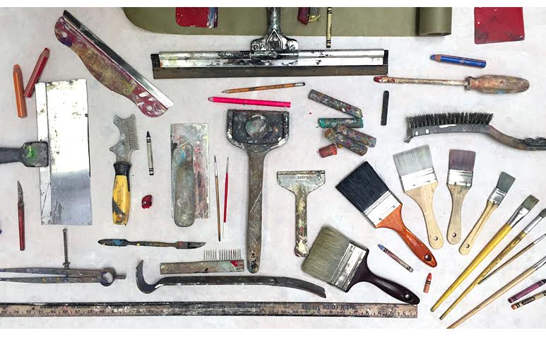
On the last painting I made I used a tiny dental picking tool. I used a #2 pencil and brushes that make fine lines. But then I also used 3 and 5-inch paint brushes. I used a 13 in roll of paper towels along with rags to smear and adjust paint. I have a car window squeegee that is about 13 in wide. I have a 7-inch paint scraper. I builder’s scribe for making large carved circles. I used a 6-inch orbital sander with 60 grit sandpaper. I used 16-inch wide x 5 ft. sheets masking paper to apply paint and adjust its texture. And I also used a house brick to gouge the surface. I have a box of greasy pastels that I constantly use in addition to oil paint.
When I laid out all the tools on the table I was kind of shocked at how diverse they all looked. Just the tools alone are interesting. In fact lining them up against each other is in a way just like a painting. Combining the small with the large. The delicate with the rough.
I realized you could tell a lot about someone’s art by looking at the tools used to make it. Maybe if the tools are varied, if they are gathered over time, discovered one by one based upon the differences in marks they each create greatly contribute to the potency of the final art.
Maybe some of the richness in our work can be discovered before we even begin.
Maybe by making an effort to push our awareness about the kinds of mark making tools we use, we can more easily create art that not only moves us, but everyone else too.
In Between the Lines
As you might have noticed, a lot of my work revolves around the concept of difference – a dark shape next to a light shape, a subtle mark next to a bold mark, and so on. Sometimes, however, these elements are too separate from one another, and as a whole the piece lacks a sense of cohesion.
Watch the video to see the little trick I use to bring everything together.
How do you unite the composition of your work? I would love to hear your approach!
Please feel free to share this with your friends, and anyone else who you think might be interested.
In gratitude, Nicholas
Shapes Shapes Shapes
One tool I like to use is large cardboard cut outs of various shapes. it’s a great way to add some variety to your mark making.
The Value of Sensitivity
I just pulled an older piece of mine out from storage and was immediately struck by how similar the marks were in terms of value. Not that this is bad necessarily, but when compared with my more recent work, I quickly saw how this older piece was not as engaging. I knew I had to change it.
Watch the video, and leave a comment. What do you think of when you look at your older work?
In gratitude, Nicholas
How to fix your art. (When it feels too busy.)
 In art, just as it is in life, more is not necessarily more. This is a hard one for me to remember. My default in may art making is to just keep adding things. If one kind of shape or mark feels good then surely 37 more will feel even better!
Unfortunately, this doesn’t always work. Somewhere along the way—just enough, becomes too much. Do you know what I am talking about? You can tell, when you look at your art from across the room and it tires you out just by looking at it.
So the obvious answer seems to be to remove things, but this can be tricky especially if you love so much of what is there already.
So here is another way to look at it …
It’s not that you can’t have lots of shapes or elements; it’s just sometimes visually too much when everything is equally noticeable. In other words, all the shapes are high contrast (different in light and dark; value difference) then all of them will be competing for the viewer’s attention.
And that, sometimes, can make you’re painting look like a garage sale. In a garage sale everything is thrown on the table and nothing is curated. We should always be aware the elements or areas that we want to make the most noticeable. And let me say, there is nothing wrong with a busy garage sale kind of painting. It is of course your preference.
But if you desire to restore a visual calm to your art, we have to edit the values of the shapes or areas so the viewer is not overloaded visually. We need to make the value differences of all the things that you don’t want us to notice at first glance so that their values are closer in value to the surrounding area’s values.
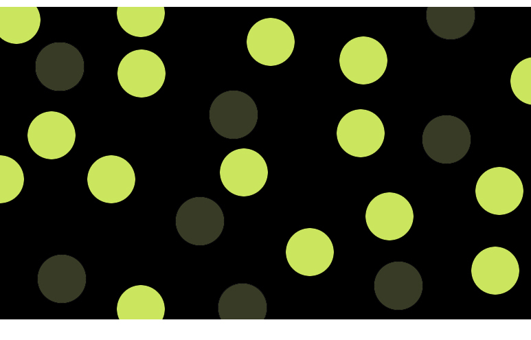
For example if you have a dark background and you have dozens of light shapes that are over crowding the painting, try making half of them darker so they sit more quietly with the background. (They are now closer in value and as a result are less noticeable.)
So next time your painting feels too busy, remember that you don’t necessarily have to throw anything away, just change some values of what is already there.
This is a very cool thing to learn so if it is unclear leave a question below and I or someone in the community will answer it!
Also pop on over to the new FB Art2life page:
https://www.facebook.com/art2lifeworld
Tomorrow, Friday July 14th at noon I will be doing a FB Live all about this topic and I can answer your questions there too!
See you tomorrow, Friday
https://www.facebook.com/art2lifeworld
Go Back to Move Forward
I’ve been working on this giant blue painting for some time, and while I like where it’s at currently, there’s still a long way to go before it’s finished.
Watch the video and see how I start to shift the composition. Leave a comment and let me know what you think!
In gratitude, Nicholas
Finding the Value of your Art
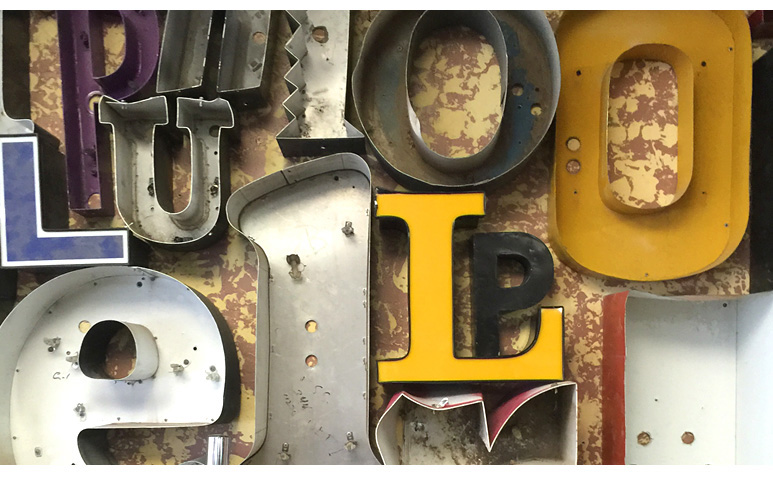
There is this really cool shop in Portland that I accidentally wandered into last week. At first blush it just looks like a metal junk shop but peering in the window as I went past, I realized that this just wasn’t any old junk shop. This shop was only selling old metal letters, the kind that you always see on top of buildings. Think of the letters that make up the words Wells Fargo Bank, Ace Cleaning, Popeye’s, or Safeway, etc. When buildings get torn down so do these old signs. Now imagine of all those individual letters all separated, gathered from various junkyards and randomly arranged upon a wall.
This is what this store looked like. The first time I passed it was closed and but it was so intriguing I just had to go back a second time. And this time it was open. Turns out the owner – a heavy set, super friendly guy in a faded orange baseball cap – used to just sell anything old and interesting. Originally he had only 5 letters. He hung them on the wall. They didn’t get much attention till one day a customer connected him with a guy in New Mexico who had a gazillion of these old sign letters. He drove down there and returned with a pick up truck full of them.
After hanging about a hundred on the wall and moving a lot of the other metal junk stuff to he back of the shop, people could clearly see this alphabet wall. The owner does not consider himself an artist, nor is he particularly interested in typography. He just hung them all up randomly on the wall. What happened next surprised him.
People would come in, stand in front of the wall and visually try to make sense of all these fragments of letters. People would read into them what they wanted. Accidentally he spelled “PIG” and he ended up selling about 5 sets of these. People would find their initials. The wall was just kind of suggesting all kinds of associations for anyone who took the time to look. Everyone would ask him what he meant to say, but for him it was just absolutely random. He just hung them up without any thought at all.
Despite this, people would still just find their own meaning in what they saw or would re-arrange them into their own words. And then much to his surprise people would buy them. He sells about 50 letters a week.
This all kind of reminded me about how when we make our own art we often wonder whether people will in fact get or understand the meaning we intend. I know this is true for me. We put so much thought into what we make that it seems important everyone, or at least most everyone, gets it. But now I am not so sure this is so important anymore.
I know it matters to me to stay focused on the thinking behind my art, especially as I am making it. But maybe it doesn’t matter that much, if after it leaves my studio, people understand it in the particular way I meant. If they connect with it in any way seems to be a far more likely outcome.
When I let go – even just a little – about worrying whether the world will understand exactly what I am making, I do feel slightly concerned. This feeling, however, is soon followed by a sense of liberation. It feels similar to when, finally, in your studio you get to that point where you can actually say to yourself that you really don’t really care what anyone thinks about what you are making right now. I am doing this for me because it just feels right. When this occurs, suddenly your art making becomes recharged, the possibilities are once again infinite, and your once smallish studio suddenly becomes significantly bigger.
In the end maybe the value you receive from your Art is given to you when you make it. Maybe as the artists, we don’t have to worry so much about how everyone else will receive theirs. We are all so totally different from one another. People will find meaning and value in your work in their own particular way. To me, this feels perfectly ok.
Right before I left the shop I couldn’t resist asking him if there was one word above all others that people would create and then buy from his wall. He said actually there were two. “Eat” and “Love.”
Maybe we are not so different from one another after all.
The store is called St. Salvage located at 3576 SE Division St Portland, OR 97202. There is no website.
In gratitude, Nicholas
For the Love of Line
One element that appears throughout my work is line – it’s such a simple concept and yet can add so much to a painting.
Given that, I thought I would share with you my favorite tools for making lines.
Watch the video and leave a comment. Do you find certain marks or shapes consistently appear in your work?
In gratitude, Nicholas
The Principle of Dimension
A few nights ago I had a handful of people over at my studio for a night of art making. My friend and sculptor Joe Brubaker brought a bunch of small wood pieces with him, and everyone had the option of glueing them to their paintings.
Adding this dimensional element to my work was at first very difficult! I found that no matter what I did, the little wood piece dominated the overall composition and threw everything off balance. Then a simple, but effective, solution hit me.
Watch the video, and let me know what you think. Do you add any sculptural quality to your paintings, or vice versa? I would love to hear.
In gratitude, Nick
PS Be certain to check out the amazing work of Joe Brubaker at http://www.joebrubaker.com/
